Complex data does not become clear simply because it is visual.
In technical industries, utility is the primary goal instead of aesthetics. Whether you are measuring project timelines or comparing month-over-month performance, the ability to understand numbers at a glance is the difference between a synchronized launch and a fragmented failure
Poorly structured data acts as a silent tax on operations. It slows product launches, bloats training costs, and leads to translation errors across engineering, marketing, and field teams. This ripple effect eventually hits the bottom line because clients hesitate when information feels fragmented, and dealers struggle when instructions lack clarity. Internal stakeholders misalign when system relationships are not communicated effectively.
The issue is rarely the data itself; it is the structure. To identify the best data visualization examples for technical industries, the format must align with purpose, audience, and engineering accuracy. When done correctly, visualization simplifies inherent complexity, empowers faster decisions, and extends the value of technical assets across marketing, sales, and training.
What Makes the Best Data Visualization Examples Effective?
The best data visualization examples in technical environments are defined by clarity, precision, and intent.
They:
- Match format to stakeholder goals
- Preserve engineering precision
- Integrate CAD or structured technical data
- Support operational and procurement decisions
- Improve clarity without oversimplification
When these principles are ignored, visualization becomes decorative rather than functional. Overloaded charts, unclear labeling, and poor hierarchy create confusion instead of alignment. Industry analyses of common visualization mistakes, such as those highlighted by GoodData in their review of poor visualization practices, consistently show that misalignment between format and purpose is the root cause of ineffective communication.
The Best Data Visualization Examples by Use Case
Selecting the best data visualization examples starts with understanding the data’s complexity and the audience’s needs. In technical industries, misalignment between format and stakeholder goals creates unnecessary friction.
Use the framework below to determine which visualization type best supports your objective.
| If the data is…. | And the audience is…. | Use this Format |
| Multidimensional system data | Strategic stakeholders | System-Level Mapping |
| Highly mechanical architecture | Maintenance teams | Component Mapping |
| Feature-dense products | Prospective buyers | Interactive 3D models |
| Process-driven operations | Dealers / Contractors | Animated Sequences |
| Trend-based performance data | Engineering managers | Line & Performance Charts |
Choosing the correct format is only the first step. Below are ten of the best data visualization examples used in technical and engineering environments, along with when and why each format delivers measurable impact.
1. Line Charts (Performance Over Time)
Performance data often serves as the foundation for technical reporting.
In engineering environments, we structure line charts to highlight measurable change without overwhelming stakeholders with secondary variables. Clean axes, controlled comparisons, and disciplined labeling ensure that trends are interpreted accurately rather than visually inflated.
Line charts are especially effective when used to:
- Track system output across operating cycles
- Compare design iterations
- Monitor efficiency or durability improvements
When performance visuals are disciplined, they reinforce engineering credibility rather than distract from it.
2. Bar Charts and Comparison Tables (Structured Evaluation)
Technical purchasing decisions rely on structured comparison.
When developing comparison visuals, we focus on hierarchy and clarity first. Specifications must be organized logically so that differences between components, systems, or vendors are immediately visible.
Well-structured comparison formats help teams:
- Evaluate performance trade-offs
- Validate specifications
- Support procurement review
- Present findings to executive stakeholders
In technical data visualization, structure carries more weight than visual styling.
3. Process Flow Diagrams (Operational Logic)
Operational workflows require visual sequencing that mirrors real engineering logic.
Each decision point, dependency, and transition must reflect how a system functions in practice. Translating technical documentation into a clear process flow demands structural discipline, not simplification for convenience.
Process flow diagrams are especially effective for:
- Manufacturing systems
- Installation procedures
- Automation sequences
- Compliance workflows
Accurate sequencing strengthens execution and reduces downstream misinterpretation.

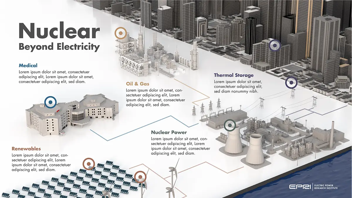
4. System-Level or Infrastructure Visualization
Ecosystem-level system maps are essential when communicating complex energy and infrastructure relationships clearly.
In collaboration with the Electric Power Research Institute (EPRI), we developed a system-level visualization that illustrated how nuclear energy integrates with thermal storage, oil and gas applications, renewables, and urban infrastructure. Rather than isolating metrics, the objective was to position nuclear energy within a broader interconnected framework and make cross-sector dependencies immediately understandable.
By structuring the visualization around system relationships instead of standalone data points, the final output supported:
- Research communication
- Strategic planning
- Policy discussions
- Executive-level presentations
In large-scale infrastructure environments, this type of structured technical data visualization enables stakeholders to see how individual components contribute to the stability and performance of the entire ecosystem.
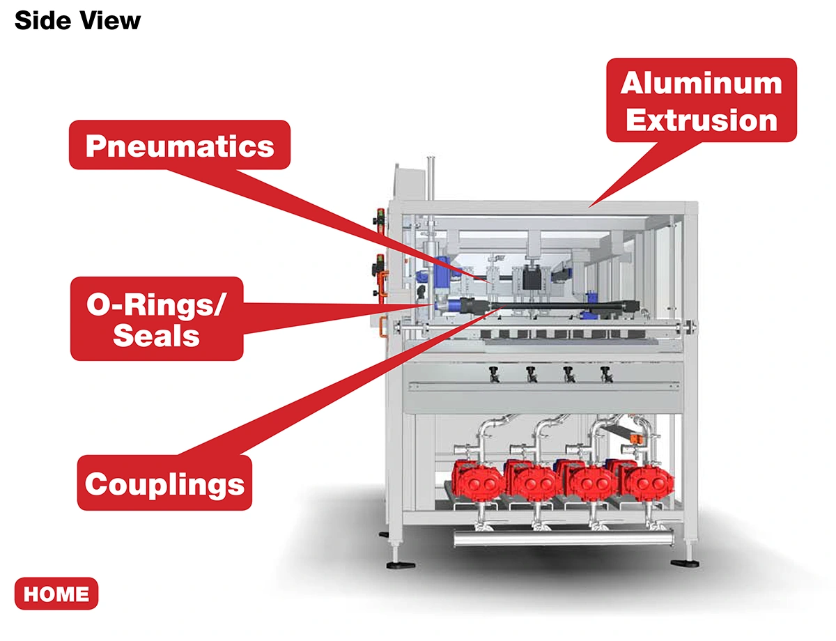
5. Internal System and Component Mapping
In complex mechanical environments, clarity must go beyond labeling. When mapping internal systems for MRO and engineered solutions clients, we work directly from engineering documentation to translate structural architecture into organized visual systems.
In one such environment, we mapped subsystems including:
- Ball screws and LM guides
- Pumps
- Motor and gearbox assemblies
- Chain and cable carriers
- Hydraulic valves and actuators
Rather than presenting a static parts list, we structured components by functional category and aligned them with manufacturer groupings across Japanese, Korean, and European suppliers. This ensured that visualization reflected not only mechanical relationships but also real-world sourcing and maintenance workflows.
The result was improved clarity across:
- Subsystem dependencies
- Maintenance planning
- Procurement coordination
In these environments, technical data visualization becomes a practical bridge between engineering design and operational execution.
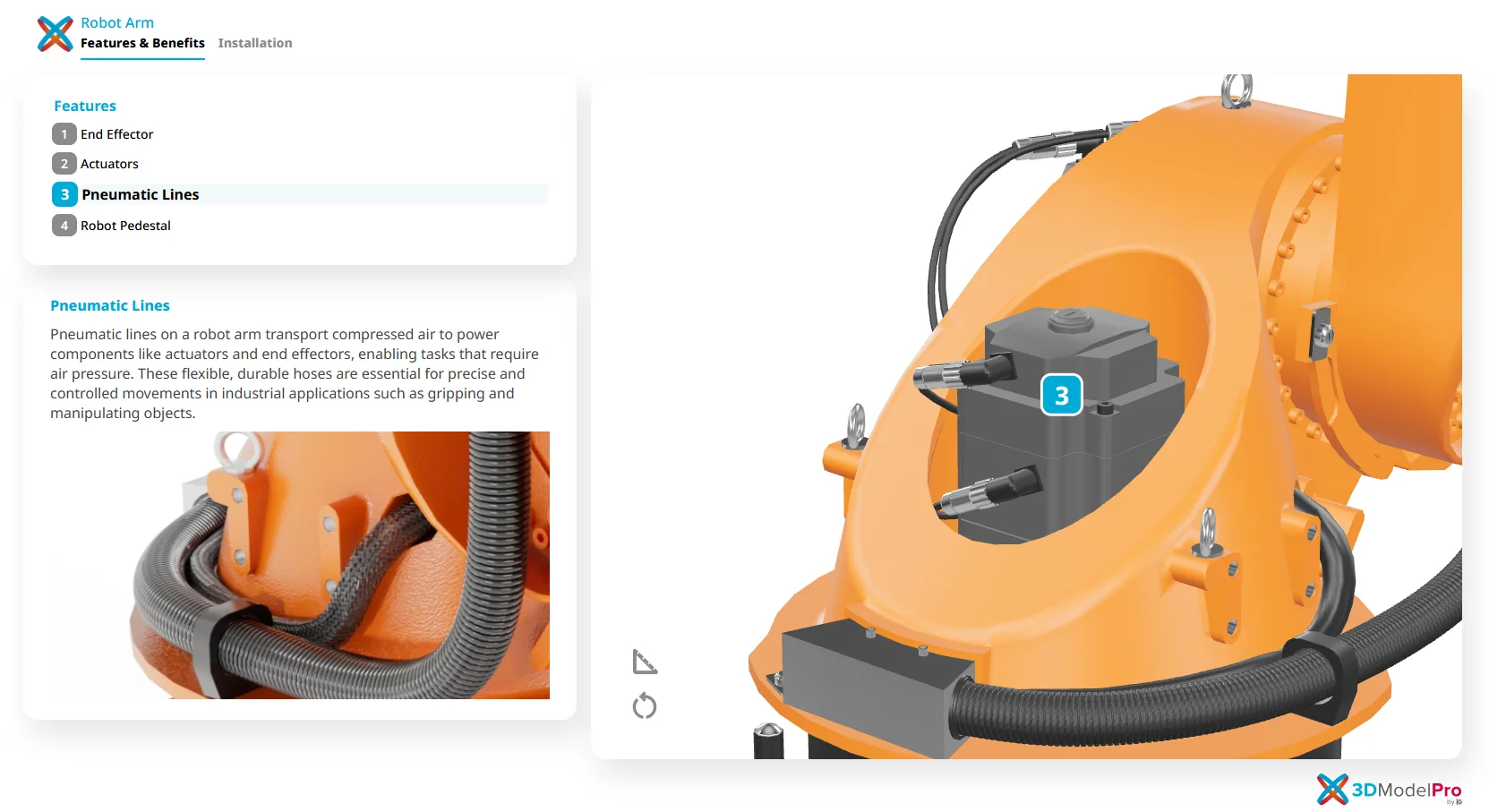
6. Interactive 3D Visualization
Interactive 3D models transform complex engineering products into structured, self-guided visual experiences.
To support this need, we developed 3D Model Pro, an interactive product visualization platform built directly from CAD geometry. The objective was to preserve dimensional accuracy and mechanical integrity while enabling users to intuitively explore complex assemblies.
With 3D Model Pro, stakeholders can:
- Rotate and inspect full product assemblies
- Zoom into detailed components
- Activate guided hotspots for feature explanations
- Explore cutaway views without navigating dense documentation
This approach has helped technical brands accelerate product launches, strengthen distributor education, and improve remote sales enablement, especially when physical demonstrations are limited.
For a deeper breakdown of how interactive product viewers support technical product pages, see our insights on their role in modern product communication.
When built from engineering assets, interactive technical data visualization bridges precision and usability without compromising system intent.
7. Heat Maps (Intensity and Distribution)
Dense performance data requires disciplined visual thresholds.
When developing heat maps, scale calibration and legend clarity determine whether insight is revealed or distorted. Color gradients must align with real engineering tolerances rather than aesthetic preference.
Used effectively, heat maps help teams assess:
- Thermal behavior
- Stress concentration
- Load distribution
- Regional performance variability
Accuracy in scale is what separates technical visualization from decorative graphics.
8. Timeline Visualization (Phased Development)
Product development and infrastructure projects unfold across interconnected milestones.
Timeline visualization provides structural clarity by mapping phases, compliance checkpoints, and cross-functional dependencies into a single coherent view. The emphasis is on sequencing logic, not visual embellishment.
Clear timeline structures support:
- Development alignment
- Regulatory tracking
- Manufacturing readiness
- Executive oversight
Sequencing clarity reduces risk and improves cross-team accountability.

9. Animated Technical Sequences and Training Modules
Some systems cannot be fully understood through static imagery alone.
When developing Computer-Based Training (CBT) modules for Case Equipment, we worked directly from engineering drawings and product documentation to animate new high-performance construction technologies step by step. The priority was technical accuracy and functional clarity.
The animation focused on clearly demonstrating
- System behavior under real operating conditions
- Mechanical interaction between components
- Step-by-step operational workflows
- Application scenarios relevant to dealers
By visualizing motion dynamically, the modules:
- Improved dealer comprehension
- Reduced ambiguity in system operation
- Supported smoother technology adoption in the field
In technical environments, animation serves an instructional purpose rather than a promotional one. It clarifies motion and sequence in ways static visuals cannot. Understanding when to use motion graphics versus static infographic formats can significantly impact clarity and engagement. For additional perspective on how each approach supports different communication goals, see our insights on choosing between infographics and motion graphics for business campaigns.

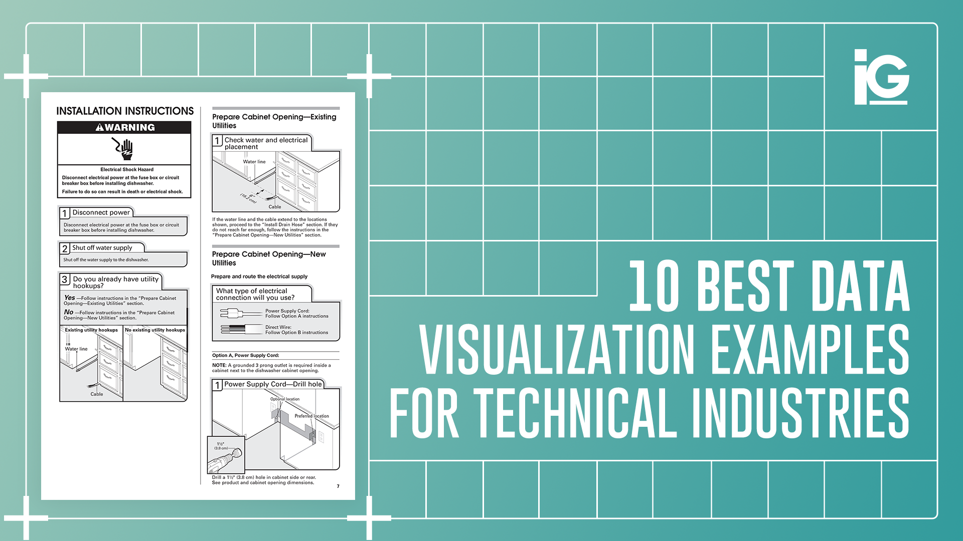
10. Step-by-Step Instruction Graphics
Clear installation guidance is critical when product specifications leave little room for interpretation.
For Trex decking products, we translated updated engineering specifications into structured 3D installation visuals aligned with real-world build conditions. Every spacing requirement, fastening detail, and sequencing step reflected manufacturer standards to ensure accuracy in the field.
By combining dimensional precision with intuitive visual sequencing, the result was a clearer, more repeatable installation workflow. The Trex 3D animation case study demonstrates how engineering-aligned visualization strengthens both comprehension and execution.
This approach improves:
- Installation accuracy
- Field efficiency
- Product compliance
- Customer confidence
Structured instructional visuals require engineering fluency and process awareness, which is why many teams work with a technical instruction agency to translate documentation into field-ready communication.
When instructional visuals are built from engineering intent, execution improves.

Frequently Asked Questions
What are the best data visualization examples for technical industries?
The best data visualization examples clearly communicate structured engineering information. These include system-level mapping, component visualization, interactive 3D models, animated sequences, and structured instructional graphics.
How do you choose the right data visualization format?
Start with the objective and the audience. Use charts for performance trends, diagrams for workflows, system maps for infrastructure, and animation for complex mechanical interactions.
Why are the best data visualization examples important in technical industries?
Technical industries manage complex systems and specifications. Clear visualization reduces ambiguity, accelerates product launches, strengthens training, and supports operational efficiency.
Can CAD files be used in technical data visualization?
Yes. CAD and engineering assets can be leveraged to create accurate renders, system diagrams, interactive models, and instructional materials that remain aligned with original specifications.
Where Visual Clarity Drives Performance
Choosing the best data visualization examples for technical industries is not a design decision. It is a performance decision.
When engineering information is poorly structured:
- Adoption slows
- Training becomes inefficient
- Maintenance confusion increases
- Procurement decisions stall
The strongest data visualization strategies integrate CAD assets, system architecture, and structured documentation early in the product lifecycle. When visualization aligns with engineering intent, communication becomes scalable, consistent, and measurable.
In technical industries, clarity drives performance.
Elevate Your Technical Data Visualization
If your team works with complex engineering data, CAD assets, or product systems, the right visualization strategy can reduce friction across development, training, and procurement.
Discover how Info-Graphics helps technical brands transform structured data into clear, performance-driven visual systems that support precision, alignment, and execution.


Leave A Comment