Product storytelling today goes beyond explaining how something works. People are not only looking at what a brand does but also how it makes them feel. And with every channel getting noisier, from feeds to ads to product pages, brands only have a few seconds to communicate value before a customer scrolls past.
That is where data-driven motion graphics become essential. Instead of forcing buyers to interpret charts, read long technical explanations, or imagine how a mechanism works, motion turns complex information into visuals people understand instantly.
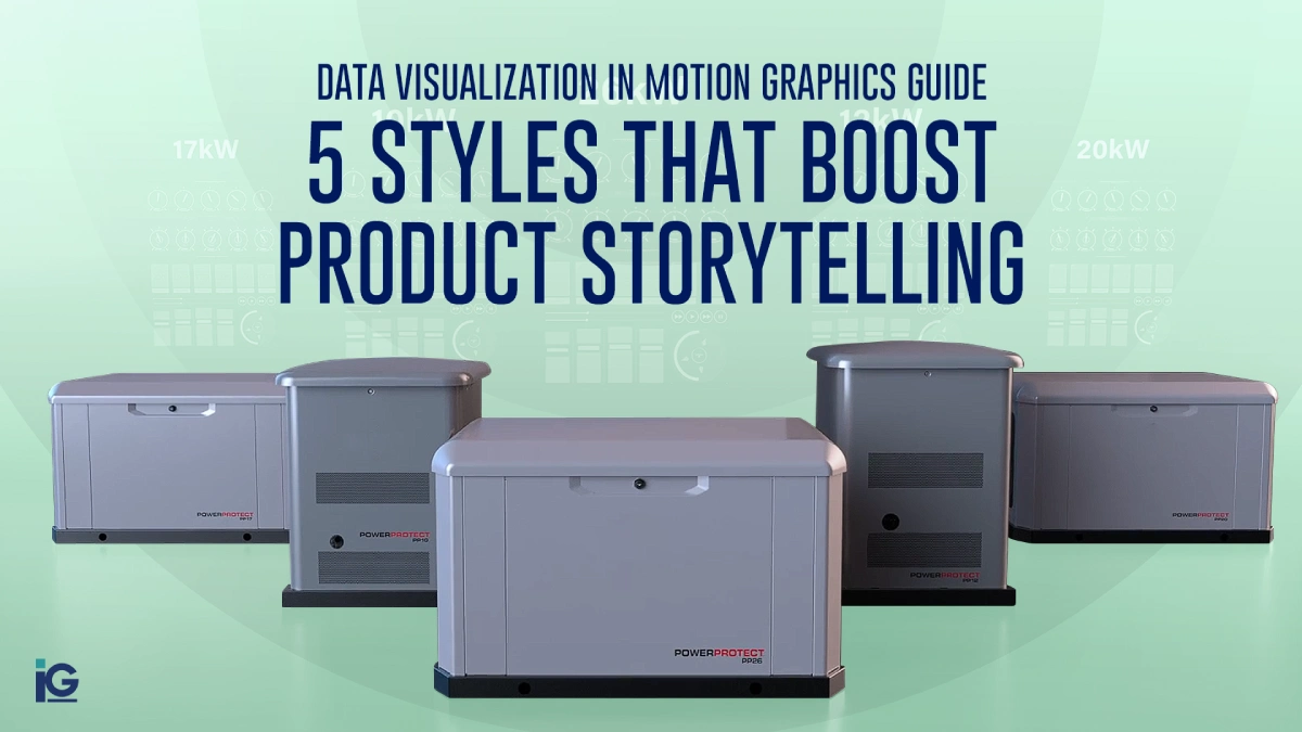
This data visualization in motion graphics guide breaks down five high-impact styles that help brands simplify explanation, highlight value, and strengthen product storytelling across digital touchpoints.
Why Motion Graphics Make Product Stories More Convincing
While graphics and motion graphics both strengthen a brand’s visual communication, motion graphics create a more precise, intentional experience. They hold attention by turning information into a clear, dynamic story instead of a block of text. With movement and real-world context, even complex ideas become easier to understand.
For instance, in training content, this makes a noticeable difference. Motion graphics show how something works, step by step, and keep learners engaged long enough for it to stick. That’s why teams that use animated or live-action sequences see higher comprehension and better overall learner engagement.
For product teams, this means:
- Faster understanding of complex ideas
- Better engagement on product pages
- Stronger technical credibility
- Fewer pre-sale questions
- A more modern and polished brand experience
Now, let’s explore the five motion styles shaping product storytelling today.
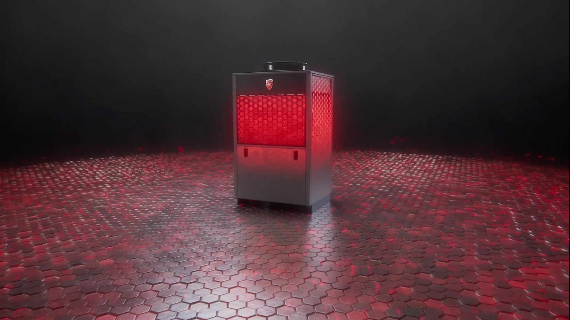
Animated 3D Metrics and Performance Visuals
Usually, when presenting raw numbers or data, it’s done through static images that help convey the results. However, raw numbers rarely tell the whole story.
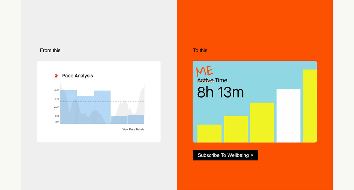
When brands present raw numbers or performance data, they often rely on static visuals. These convey the information, but they rarely represent the whole picture. Animated metrics change that by transforming data into movement — showing speed, torque, airflow, durability, temperature, and load capacity in a way that feels clear and immediate.
A strong example is SuperSide’s work with Strava. Strava, known for data-heavy content aimed at serious athletes, wanted to connect with a new audience: health-oriented female runners who value wellbeing, “me time,” community, and enjoyment. To support this shift, their visuals moved from straightforward static graphics to vibrant, motion-driven assets. The result reframed running from a performance-focused activity into a more social, joyful, and personally meaningful experience.
This is why animated metrics tend to work best in situations where visual clarity matters most:
- Before and after comparisons
- Technical product specs
- Highlighting performance advantages
- Engineering or manufacturing-focused visuals
Animation helps viewers feel the improvement, not just read it. Performance gains become more dramatic, competitive advantages emerge more quickly, and the message carries greater credibility.
2. Process Walkthrough Animations
Some products only make sense when you can see the internal process behind them. Process walkthroughs translate airflow systems, safety mechanisms, assembly steps, and component movement into clean and easy-to-follow visuals.
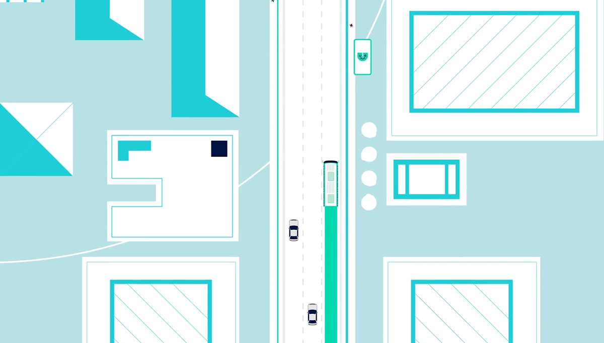
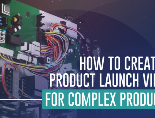
We worked with: This 2D product explainer animation showcases the features and benefits of the Umo Scanride system that both transit agencies and transit riders experience. Cubic partnered with Info-graphics to develop a product launch video for their system that streamlines fare capping and other improvements transit agencies offer to riders. From the rider’s perspective, managing your fare costs and riding public transit is made simple. These are smart, easy-to-install, and versatile products that streamline processes across all aspects of large transit systems.
Common use cases:
- Explaining mechanical systems
- Internal component motion
- Engineering concepts
- Step-by-step product
A process that takes ten minutes to explain verbally can be shown visually in a few seconds. This reduces confusion, shortens the sales cycle, and helps technical buyers understand value quickly.
3. Data-Driven Infographics in Motion
Animated infographics turn charts, numbers, and insights into visuals that feel lively and memorable. They work exceptionally well for product launches and presentations where performance and value need to be clear and fast.
In the Pitch 2.0 sales presentation, motion graphics introduced key metrics one step at a time rather than overwhelming viewers with a full slide of numbers. Cost savings, ROI impact, and benchmark comparisons appeared in a guided sequence, making the message easier to follow and far more persuasive. The movement reinforced each point and helped the audience understand not only the data but also the reasoning behind it.

Best for:
- Benchmark comparisons
- ROI claims and savings
- Market insights
- Customer analytics
- Sales pitch visuals
Movement reveals information in a controlled sequence. It guides the viewer’s eye and prevents overwhelm. Instead of showing everything at once, infographics build the message one step at a time.
4. Interactive Motion Charts
Interactive motion charts bring data to life by letting users explore information in real time. Instead of passively viewing a static graphic, buyers can rotate, zoom, and inspect details as if the product were right in front of them.
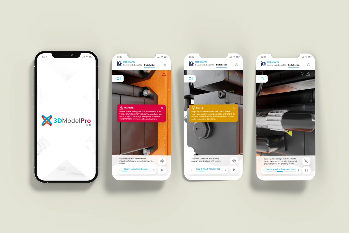
A great example is our 3D Model Pro experience. Users can spin, zoom, and flip a product from every angle, then dive deeper through hotspots that reveal videos, cutaway renders, and technology explainers. It transforms a standard product page into an interactive learning tool that helps customers understand features, benefits, and technical details without overwhelming them.
Use cases:
- Interactive product pages
- Hover-trigger animations
- Dashboard or UI previews
- Click-based data exploration
Interactivity increases engagement and time spent on a page. When buyers can explore at their own pace, they absorb more information, stay curious longer, and walk away with a clearer understanding of your product — a modern and highly effective approach to digital communication. For a deeper dive, see our detailed guide on interactive product viewers
5. CAD-Powered Motion Graphics
CAD-powered animations are ideal for technical and industrial products. By working directly from your CAD files, you can reveal internal components, exploded views, assembly steps, and technical behaviors that photos simply can’t capture.
At AHR 2025, we created a 3D launch video for Lochinvar’s new Veritus heat pump to highlight its eco-friendly, energy-efficient technology. The animation drew more visitors to their booth and boosted interest in the product—showing how compelling CAD-based visuals can be for trade show impact.
Best for:
- Engineering-heavy products
- Precision components
- Industrial equipment
- Products where accuracy is critical
CAD-driven visuals bridge engineering and marketing, turning technical files into precise, polished animations while reducing production time.
How to Choose the Right Motion Style
Selecting the right motion approach depends on the type of story you need to tell and the level of clarity your audience requires. Here is a simple guide to help you match each style to the exemplary scenario:
- Use animated metrics to demonstrate performance or highlight measurable improvements.
- Use process walkthroughs when your product involves internal mechanisms or multi-step functions that benefit from clear visual explanation.
- Use animated infographics to communicate ROI, benchmarking data, or market insights in a more engaging way.
- Use interactive charts to increase website engagement and allow users to explore information at their own pace.
- Use CAD-based animation when accuracy, precision, and technical detail are essential to the story.
Many brands find that combining two or three of these styles creates a more complete and persuasive product narrative.
FAQ
1. What is data visualization in motion graphics?
It is the use of animated elements such as charts, metrics, processes, or CAD visuals to make technical data easier to understand and more engaging.
2. When should brands use motion graphics instead of static images?
When the product has complexity that isn’t obvious at first glance, motion helps clearly show mechanisms, performance, and value.
3. Can motion graphics be created from CAD files?
Yes. CAD-to-animation workflows are common and ensure both accuracy and efficiency.
4. Are motion graphics effective for B2B products?
Very. They help explain technical products faster, which improves buyer confidence and speeds up decision-making.
5. Do motion graphics help improve product page conversions?
Yes. Animation increases engagement, reduces bounce rate, and gives customers a clearer understanding of what they are buying.
Bringing It All Together
Data-driven motion graphics give brands a faster, more straightforward way to show value. When performance metrics move, mechanisms animate, and CAD files become visuals, buyers instantly understand your product. It removes friction and helps them grasp the benefits without having to dig through dense explanations.
In a crowded digital space, the brands that communicate visually — and efficiently — are the ones that stay memorable.
If you’re curious how motion graphics can elevate your product storytelling, feel free to explore some of our recent 3D and motion work for ideas and inspiration.


Leave A Comment