Things Could Get Graphic
Start your projectTrusted by leading brands
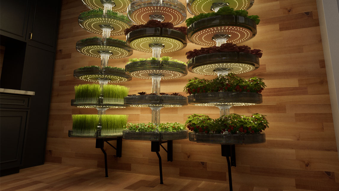
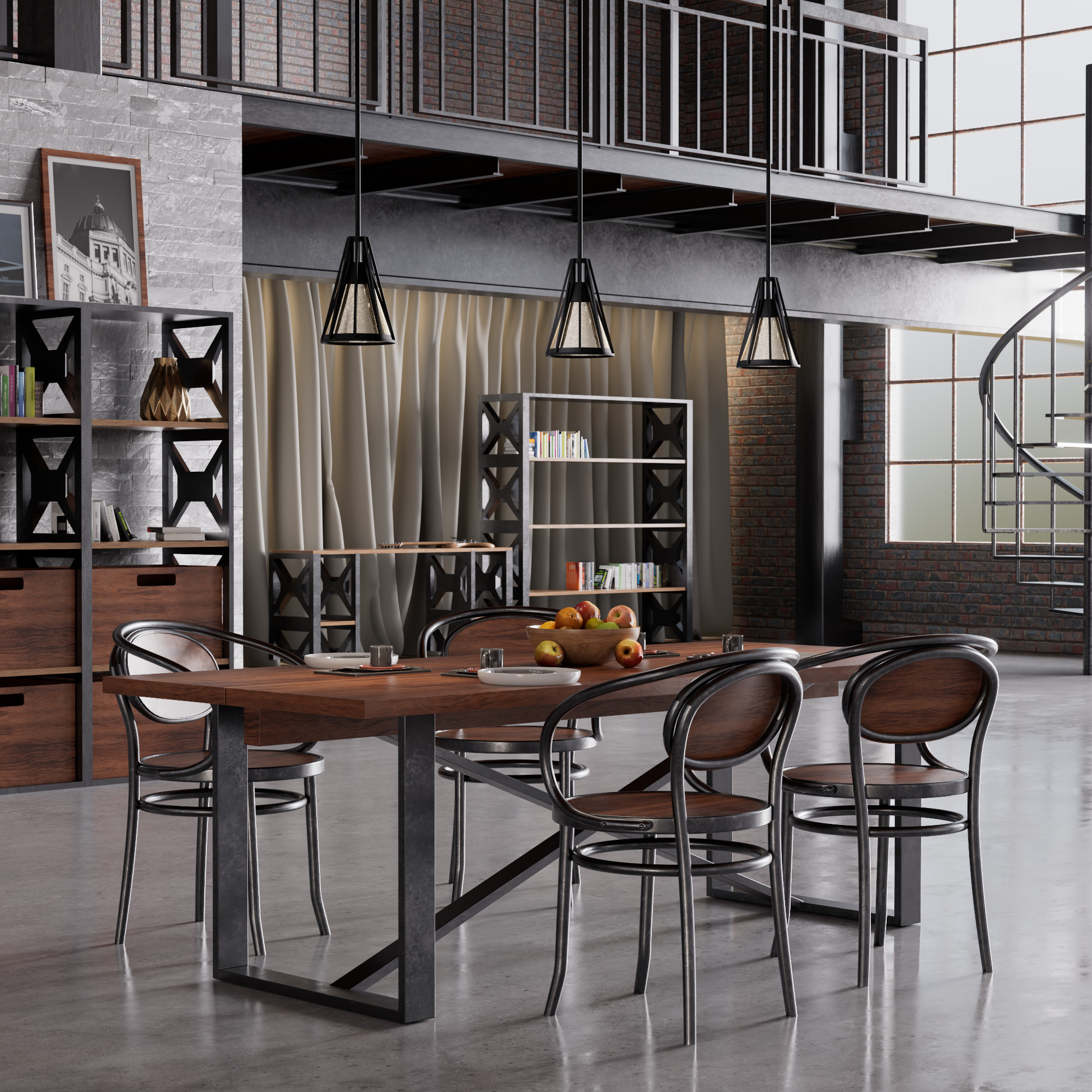
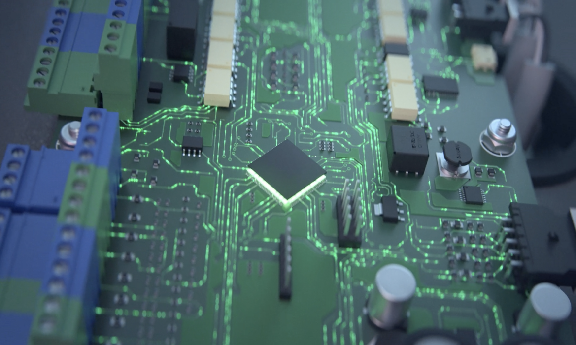
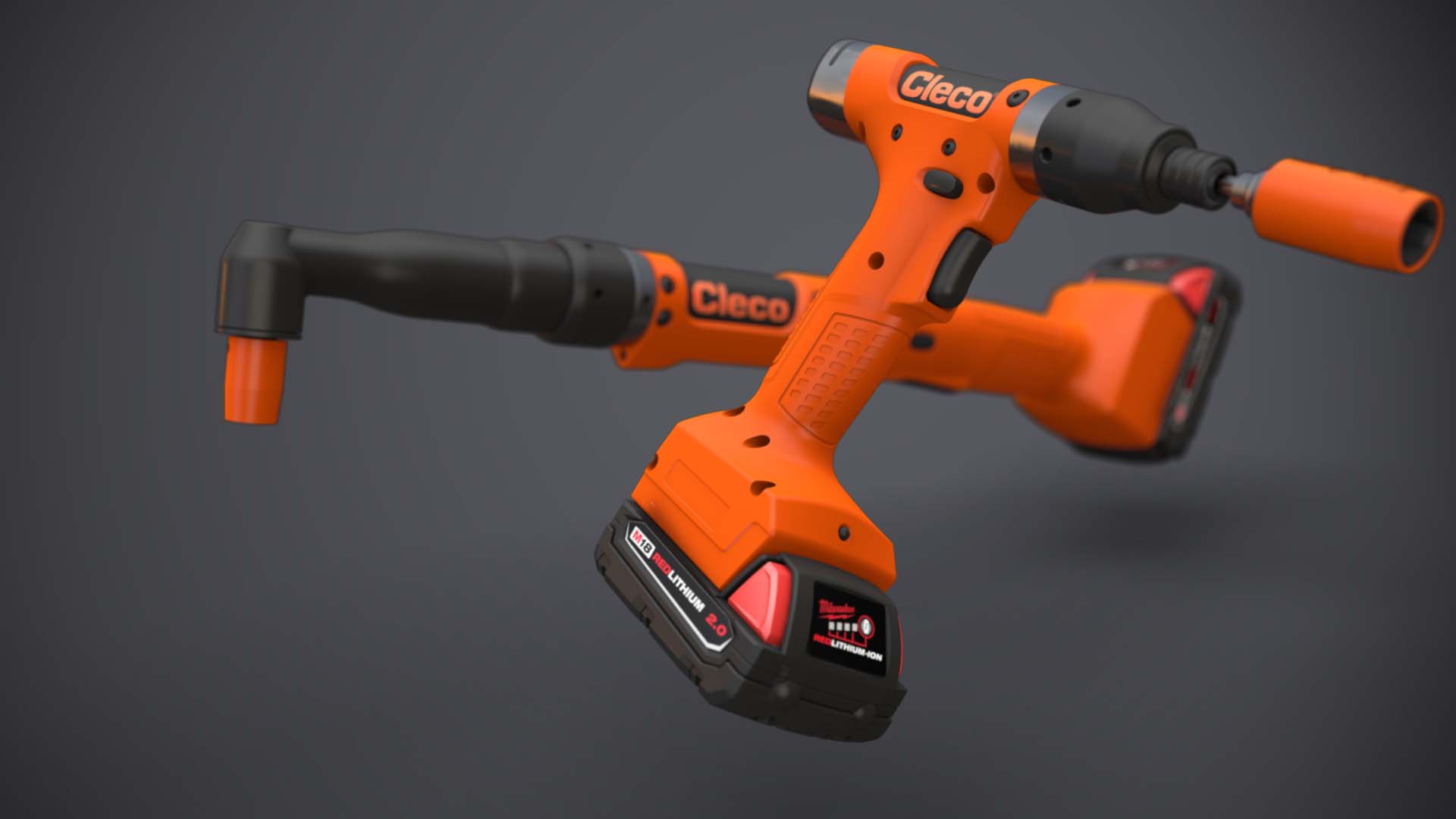
Featured Work
Product Animation, Renders, Design, Instruction, oh my!
Our Process
Your brand speaks volumes, so let's turn it up!
Discovery
Unlike your therapist, we actually have solutions to your problems. Meeting your team is the first step in the process. We want to identify your challenges and develop a custom solution.
Ideation
Who needs Pinterest when you have us? With your vision in hand, our team of talented designers get to work on developing mood boards, style frames, and outlines to start bringing your ideas to life.
Drafting
After your go ahead, we’ll dive into the deep end and not come up until your project is just right. (turning purple a possibility)

Delivery
Your shiny new product animation, design piece, or render is so good your mom will wish she could put it on her fridge.
Our Services
- Instructional Design
- Animation
- Design Services
- E-Learning
- 3D Rendering
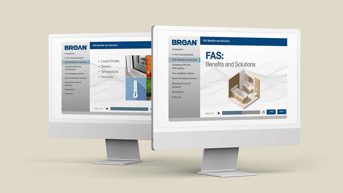
Instructional Design
Did you read the instructions? If not, you will now
We create clear instructional documents that illustrate the assembly, operation, and care of your products so your customers will want to read them! Our user-friendly documents make it easy for anyone to understand.
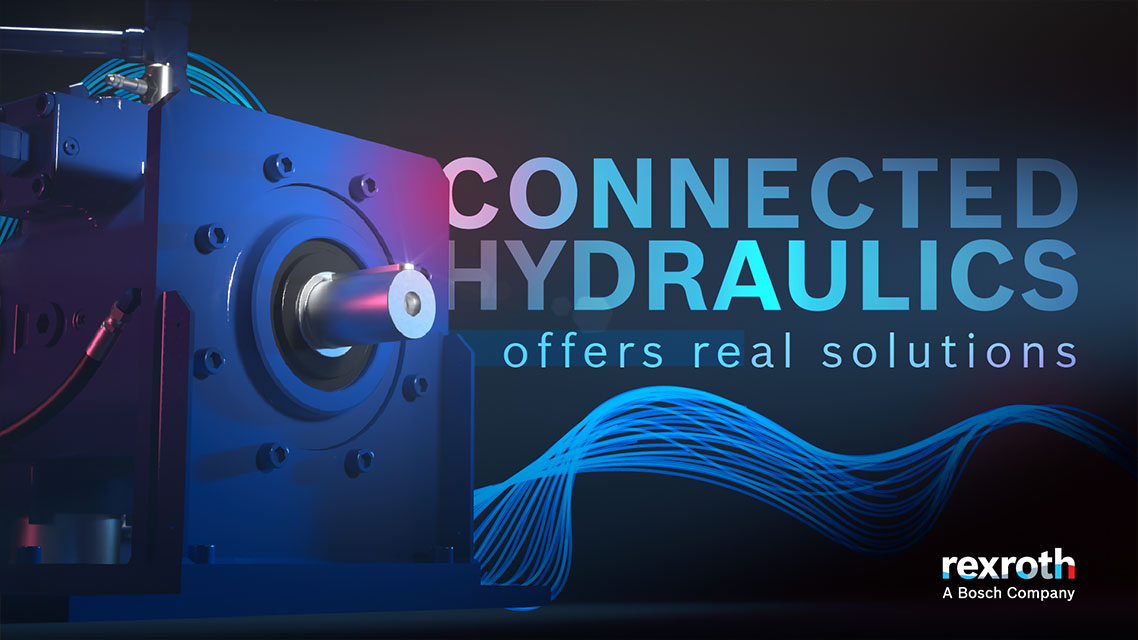
Animation
Your product is the star of the show
3D animation, visual effects, and motion design break the barriers of language, culture, and education. Animation can communicate the important aspects of your product or service (popcorn sold separately).
Design Services
We know your best friend's boyfriend's cousin is a “graphic designer”...
…but maybe leave it to the professionals. Visual content is VITAL to sharing your products and story with the world. Lucky for you this is our forte. Let us show you what we’ve got!
E-Learning
E-Learning doesn’t have to be boring
Show, don’t tell! Our E-Learning content and tools are the next step in engaging and educating your audience for a better learning experience.
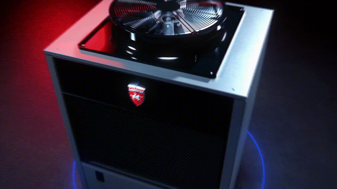
3D Rendering
Wait, that wasn’t a photo?
No, it’s actually a 3D Render. Our team of 3D artists can transform your product into a photorealistic image in almost any environment before it has even launched. Your customers can plan their buy before it hits the shelves.